Data-Driven Science
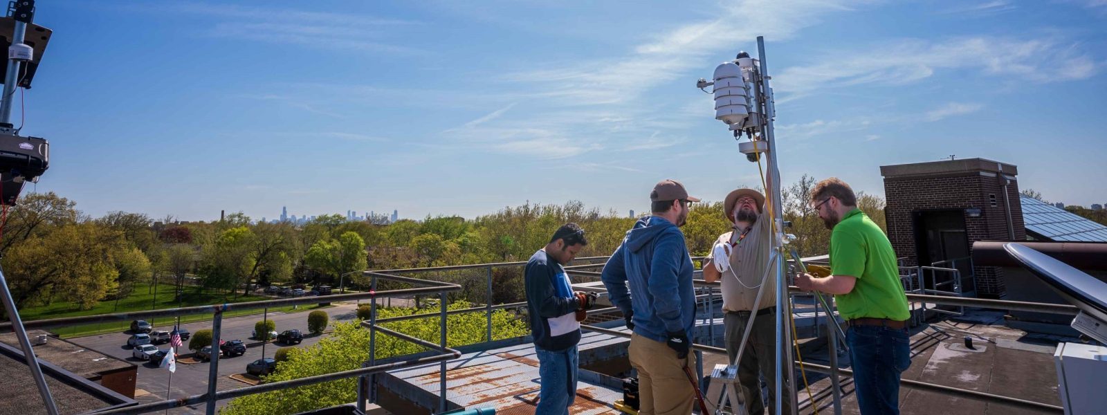
We collect data at sites around Chicago. Our goal is to gain insights into the city’s atmospheric conditions and to better understand urban heat islands, extreme rainfall and local-scale atmospheric interactions.
We collect data on:
- Temperature
- Humidity
- Rainfall
- Atmospheric composition
Some of our data feeds return “raw” data, while others can show maps and graphs. There are three main ways to access CROCUS data.

CROCUS Cookbooks
For our most intuitive visualizations, visit our instrument cookbooks. These cookbooks detail the instruments, how to work with instrument data and free, open-source software examples so you can create your own visualizations.
For immediate access to data, visit the Quick Looks section and explore updates on things like atmospheric composition and dew point.
Waggle Node Dashboard
Dive deeper into the data with our Waggle Node Dashboard.
Special features of the dashboard include:
- Ability to see data based on specific date range
- Automatic data visualizations
Quick start guide:
In the lefthand side bar, use the dropdown lists to find the data you want.
- Select which sensors you’d like data pulled from.
- Select which data you’d like to see.
- Choose your time frame.
- Click search.
When you find the information you want, you can view and download the data as CSV files and graphs as PNG files.
Sage Data Reports
Sage brings you our most up-to-date data from our nodes. Some weather instruments send CROCUS reports as frequently as every hour.
HINT: Not sure what an instrument label means? Clicking any blue text will provide additional explanations for the information that specific instruments are collecting.